

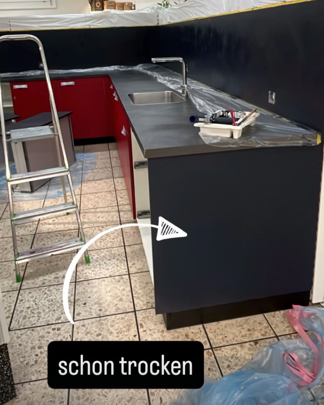
Now that our counter is finally in place, we've also decided on its color. And honestly: that was probably one of the most difficult decisions ever.
Our counter is huge. It's the first thing you see when you enter the shop and will be the focal point of the entire room. It should be a real highlight – but at the same time so timeless that it doesn't seem too flashy or "too fancy" to us in just a few months.
My personal favorite for a long time was a strong pumpkin orange. 😄 But in the end, we found the perfect compromise together: Ink – a deep, ultra-matte dark blue. Elegant, calm, and timeless. Combined with golden accents, it creates exactly the look we want for GrowTastic. And let's be honest: everything is a little bit nicer with gold anyway.
Yesterday we started painting. And wow... this counter really has a lot, a lot of surface area that devours paint. 😅
The first sides of the rear counter section are now dry – and I have to say: Yes! That was a really good decision. The color looks just as high-quality as we had hoped, and I can't wait to see the first complete cabinet finished.
With a bit of luck, we'll manage that this week. Another small step and GrowTastic feels a little more like the place we had in mind from the beginning.


Share :
Together we're opening GrowTastic – Now we need your support
We've found the perfect display for our Root Pouch